AI to Fix Video Color: How to Get Natural Results
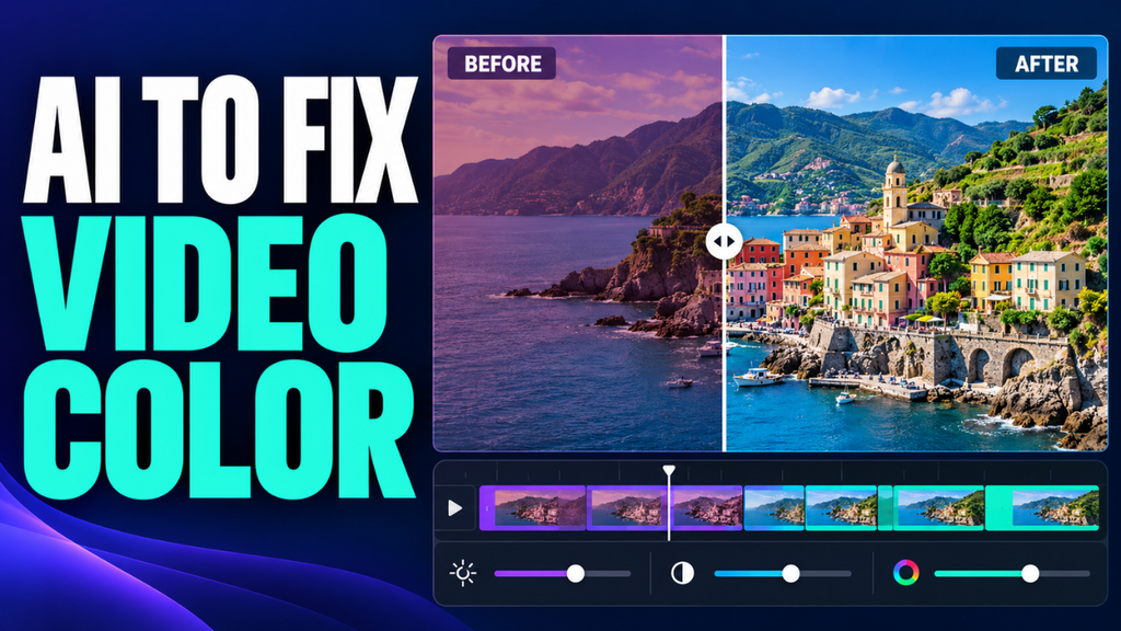
Your video is sharp, the sound is clear, and the moment is worth keeping. There’s just one problem: everyone looks orange. Or the room looks blue. Maybe the clip looked fine on your phone, but now it seems strangely washed out.
That’s usually when you start looking for a quick color fix.
Automatic correction can give you a useful starting point without hours of moving sliders. The trick is knowing what needs correcting, checking what the software changed, and stopping before the footage looks overprocessed. A believable result often comes from smaller adjustments than you’d expect.
Table of Contents
- Why your footage looks wrong
- What automatic correction can actually fix
- Start with one clip and a simple correction
- Where to find useful automatic tools
- Give skin tones the final say
- Make neighboring clips feel connected
- Recognize the limits of the original recording
- Check the export before you finish
Why your footage looks wrong
Before touching any controls, describe the problem in ordinary language. Is the picture too dark? Does a white wall look yellow? Are the colors weak, or are they so strong that faces look sunburned?
Those are different problems. Treating all of them with more saturation rarely ends well.
White balance affects whether an image leans warm or cool, with tint adjustments helping address green or magenta casts. Exposure concerns brightness. Contrast changes the separation between darker and lighter areas. Saturation controls color intensity.
Picture a restaurant video recorded under warm ceiling lights. The food looks orange, so you reduce saturation. Now the food looks dull, but the orange cast remains. Adjusting white balance would have addressed the actual problem.
Also consider the lighting itself. A warm lamp and a cool window can illuminate different parts of the same face. That’s harder to correct with one adjustment across the whole frame.
What automatic correction can actually fix
Automatic color tools analyze the image and calculate adjustments. Depending on the feature, those adjustments may affect exposure, contrast, white balance, or the relationship between one shot and another.
They can be helpful when a recording needs a modest lift: an interview that’s slightly dim, an indoor clip with an unwanted tint, or several shots that don’t quite agree.
Here’s the thing: the software doesn’t share your memory of the scene.
It may treat the amber glow of a cozy room as a color cast. It might brighten a deliberately shadowy performance until the atmosphere disappears. A technically balanced image isn’t always the image you wanted.
Think of automatic correction as a suggested edit. Compare it with the original and decide whether it improves the scene. There’s no prize for accepting every change.
Start with one clip and a simple correction
Keep the original file and work with a reversible correction in your editor. Choose a representative clip, preferably one containing a face and a familiar neutral object.
Before applying anything, check whether the recording uses HDR or a flat log profile. Those formats need appropriate color management. A flat log recording isn’t necessarily underexposed, and an HDR clip shouldn’t be forced into a standard workflow without the correct conversion.
Now apply the automatic correction once.
Toggle it off and on. Look at the face, the brightest important area, and something that should appear neutral. If the result looks too aggressive, reduce the correction’s strength where that option exists, or ease back individual adjustments.
Next, fix the most obvious remaining issue. If everything looks yellow, adjust temperature. If the image has a greenish cast, try tint. For an eyedropper white-balance tool, sample something genuinely neutral under the subject’s lighting, avoiding colored objects or blown-out highlights.
Then check brightness and contrast. Lift a dim subject carefully while watching bright windows, lamps, and white clothing.
Leave saturation until the basic balance feels right. It’s surprisingly easy to mistake stronger color for better color.
Finally, play the whole clip. A paused frame won’t reveal whether changing light makes the correction look wrong halfway through.
Where to find useful automatic tools
If you already use Adobe Premiere, start with Lumetri Color. Select your clip, open the panel through Window > Lumetri Color, and use Auto in Basic Correction. Adobe also provides an Intensity control, so you can soften the overall correction before refining individual settings.
DaVinci Resolve offers automatic balancing on its Color page, alongside controls for manual refinement. Its Shot Match feature can also bring a clip closer to a chosen reference shot. That’s useful when a sequence feels inconsistent rather than simply too warm or too dark.
For occasional phone footage, a simpler editor may be enough. Look for a before-and-after preview, an undo option, and access to temperature, tint, exposure, and saturation.
I’d choose those controls over a large collection of dramatic filters. Being able to reduce a correction matters more than having another preset called “cinematic.”
Give skin tones the final say
A bright sky can look impressive while the person underneath it looks completely wrong.
After an automatic pass, pay close attention to faces. Look for unnatural orange, pink, gray, or green shifts. Check whether cheeks still have detail and whether bright areas on the forehead look harsh.
There isn’t one correct brightness or color for every face. Skin tones vary, and lighting changes how they appear. The goal is believable skin for that person in that setting.
Say you’re editing a birthday video under warm lights. Removing every trace of warmth might make the wall neutral while making everyone look cold and pale.
Keep some of the room’s character. If the background looks right but a face still needs work, a selective correction or tracked mask may be more useful than another adjustment to the entire frame.
Make neighboring clips feel connected
A corrected clip can look lovely by itself and still feel wrong in a sequence.
Imagine cutting from a warm close-up to a cool wide shot of the same conversation. Viewers may not identify the temperature shift, but they’ll notice that something changes.
Choose a reference shot that represents the scene well. Compare the other clips against its brightness, skin tones, and overall balance. In Premiere, Comparison View and Apply Match provide an automated starting point for this process. Premiere
Don’t expect identical settings to create identical results. Different camera angles can include different amounts of sky, wall, or shadow.
Match the appearance, then watch the cuts at normal speed. Once the scene feels consistent, consider adding a restrained creative look across it. Applying a strong style before balancing the clips makes inconsistencies harder to judge.
Recognize the limits of the original recording
Let’s be honest: some footage can be improved without ever looking clean.
If a bright area was clipped during recording and its detail wasn’t captured, lowering exposure won’t bring that missing texture back. A white window may become gray rather than reveal a view outside.
Dark footage has its own problems. Raising shadows can make existing noise and compression artifacts more visible. Strong color adjustments may also reveal banding, where a smooth sky or wall breaks into visible steps.
Those are reasons to make smaller corrections, not keep pushing.
Mixed lighting can also defeat a global fix. Correcting the blue side of a face may make the warm side look stranger. Selective adjustments can help, but they take more care.
Sometimes the best result keeps the shadows a little deeper or leaves part of the background imperfect. Prioritize the subject and the moment.
Check the export before you finish
Don’t judge the finished video only inside the editor.
Export a short section containing a face, a bright area, and a darker shot. Watch it on the device or platform where people will actually see it.
If the export looks washed out, check color management and playback differences before increasing contrast again. Adobe documents how different viewing applications and display gamma can change the appearance of an otherwise consistent export.
For a standard SDR delivery, Rec.709 is a common output choice. HDR delivery needs an appropriate HDR workflow. Make sure the source interpretation, project settings, and export destination work together.
Also turn off night-mode display tints while making color judgments. A heavily warmed screen can tempt you to make the video unnecessarily blue.
The best correction usually stops drawing attention to itself. Faces feel believable, the lighting still suits the setting, and cuts don’t jump between unrelated colors. Use the automatic result to get started, make a few deliberate refinements, and stop when the footage serves the moment. More adjustment isn’t always more improvement.
Meta description: